
There is no question that I love to see the projects that creators are proud of. I also love to see these projects, when they are photographed in a stylized photoshoot. There's not much better than looking at these works in an idyllic set-up with perfect natural light, simple white backgrounds and cozy details like plants (always with the plants!) because those take a hell of a lot of effort! But I think there is something even better to look at; That is bursting the bubble of designers/artists/craftsmen etc. and having a look behind the scenes.
I find it interesting that when work is created it leaves behind a wake, one that is invisible to the audience. The conditions of which the work was created are a total mystery to all except the creator. Maybe that's why I find it so fascinating when people do share these views. I feel like I somehow understand the work more and then form a deeper connection with it.
So that's what I'm doing now! I'm lifting the veil of my studio. Showing the work AND the madness that it takes to create the work. It's not galm, but it's real and that is what is valuable to me.
Enjoy this unconventional show-and-tell!


I've recently become infatuated with using cut paper as a tool for lettering. I like the way it mimics the effect of vector forms that are common with computer generated graphics, such as type itself.
Layering paper, measuring, cutting out shapes, moving things around again and again and then applying glue has been my rhythm for these projects. It looks like a tornado of paper at times. I then set up a very small photo studio to shoot this project on. Having a minimal background IS way less distracting (even though it can be a bit cliche to use these days). But yeah, mine is tucked in a corner and has easy set up and tear down. The flat surface is a piece from the IKEA as-is section and the paper is just a large piece of watercolor paper that I attached to the wall with blue painters tape.

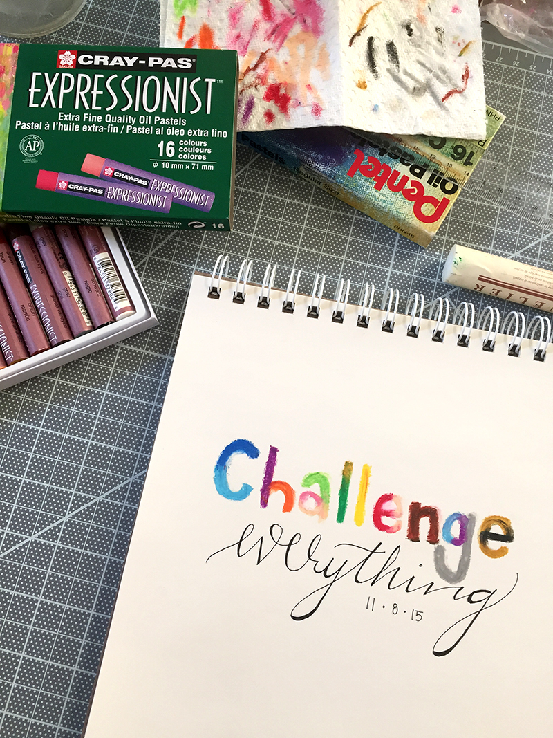
This small color explosion comes from my Daily Intentions series that I post to Instagram. I used bright colors in a very stabile looking san serif type for the word 'challenge'. The contrast of type forms and color were interesting to me. I used oil pastel crayons instead of ink for a different texture. This proved to be a difficult to keep everything tight. A little bit of wobble around the edges was fun though.
Anyway, in order to keep the colors true and saturated I used a combination of the oil pastel crayons, a blending stick, and a paper towel (see above). That paper towel was used to clean off each crayon before and after each use to make sure each crayon was going to be clean. I also used a straight edge to make sure my baselines were anchored. Keeping this colorful medium under control was a huge challenge that went with my message better than I intended.
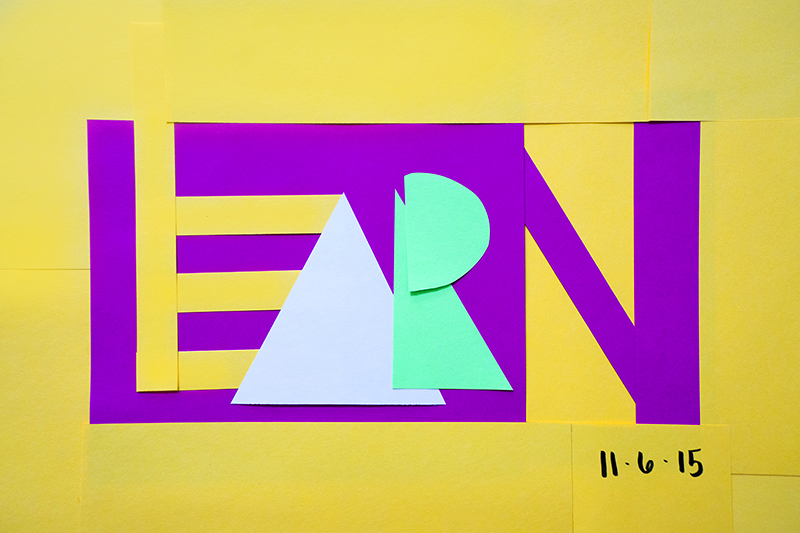


Here is another project form my Daily Intentions series that is also based on cut paper. This time the scale at which I was working was much larger. I cut my pieces at my table and then basically sat on the floor moving things around for maybe 30 minutes to get it in place in a way that challenged the color palette and the shapes. Just when I thought I had it right, I would take a photo and notice something that should change. A lot of back and forth with this one!


I took my lettering game to a new level last weekend when I was asked to make wedding signs! Before this, I had not worked with chalkboard art at all. I was excited to give it a go though! I was given the boards, what they should say and the pens, but the artistic direction was up to me.
I did rough draft drawings for the larger signs on paper. When I had my plan I then drew on the boards with pencil and made edits before using the markers. The markers were permanent so the pencil lines were crucial! With the help of my rulers the baselines were all straight. Using a ruler is really the best way to get hand lettering to look professional. Once I inked the pencil lines I used my eraser to remove any visible pencil marks and then used a large paint brush to gently remove the eraser dust. I did two coats of everything written in white because the white would fade a little too much when it was fully dry. All in all I would say this took me about 4 hours to complete, maybe 5 with breaks.
—
Hope you enjoyed this post and a little more talk about to 'how' of these pieces!
sidenote:
a few work essentials I always keep within arms reach away are…
- A glass of water
I do this to remind myself to drink more water. When I'm working I tend to forget about everything else which is no good. Having water near by means I'll come up for air (and water) occasionally. - H2 pencil & Pentel Click Eraser
H2 is my favorite lead for pencils when it comes to illustration and lettering. It creates a very light line and it's easy to erase. The click eraser is just so easy to use. I've had the one I have now since high school, possibly middle school! I just buy refills and keep on truckin'. - Chap stick
To be honest, chap stick is almost always an arms reach away from me. - Chocolate
I'd say it's for an emergency supply of energy, but really it's because I like it!