DESIGN IN MASS PRODUCTION

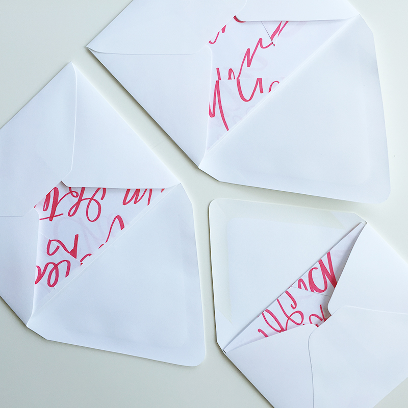
When I think about mass produced cards, I think one design, run through a fancy printer like a zillion times (very nicely, of course). But I ran into an opportunity a little while ago that lead me to think about mass production in a different way with my small scale Drawn & Delivered card project. This method even involves recycling so for this girl who uses (what feels like) a metric ton in paper it made me feel really good.

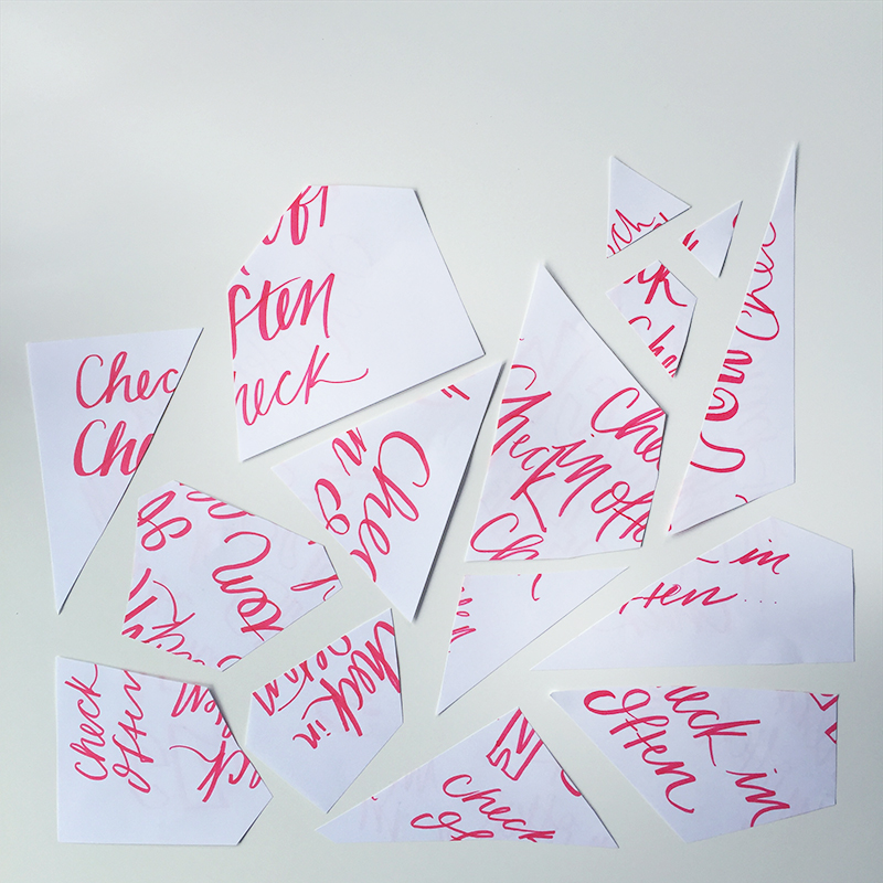
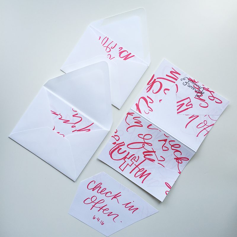
One morning, I spent an unusually looooong time working on my #dailyintention of the day to share on my Instagram and I wound up with 5 or 6 sheets of paper that I would have otherwise chucked into our recycling, but after becoming more interested in cut paper and mixing texture, it lead me to think about how I could use these sheets differently. I was also a llllllittle behind on my card schedule so all of this paper and started to look like an opportunity.

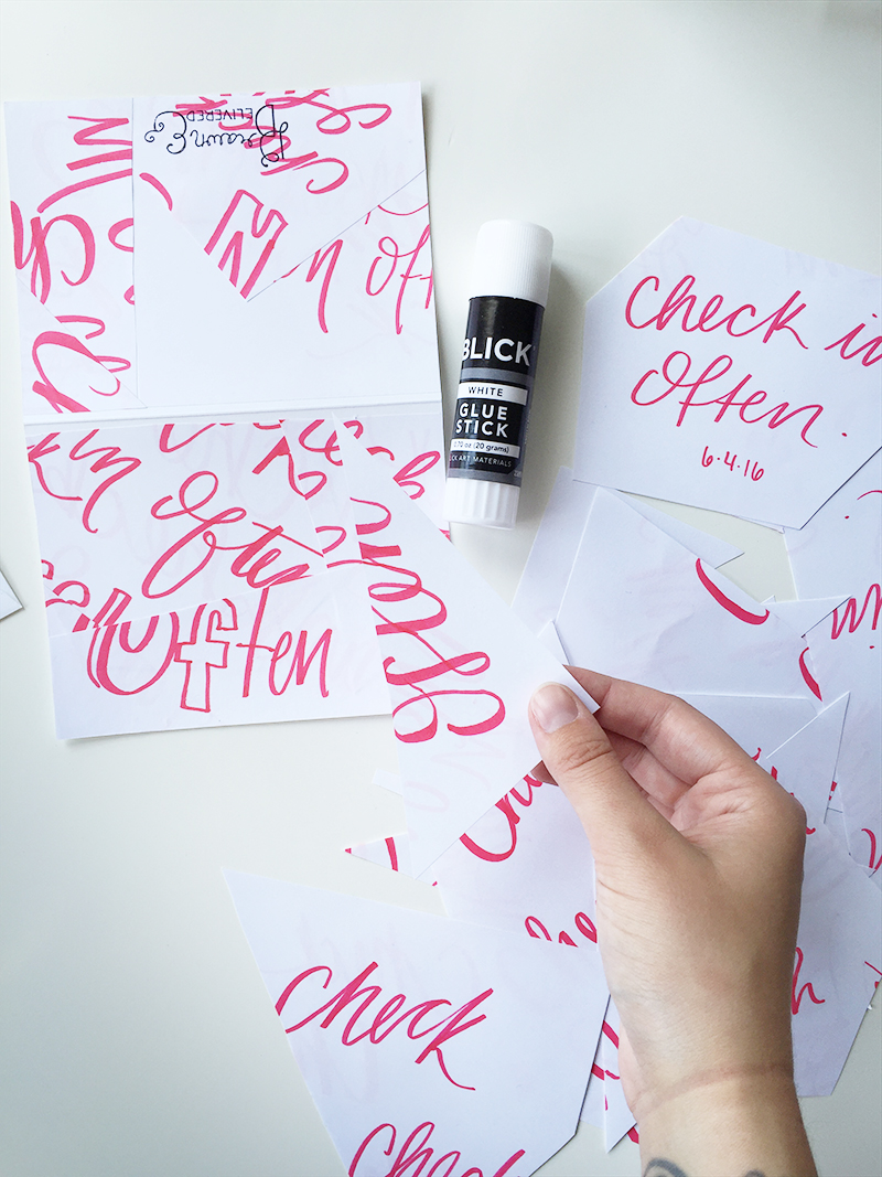
I sat down after randomly cutting up the pages and arranged them onto the cards. I liked how abstract everything was looking and the strange amounts of white space I was noticing too, so I opened up my glue stick and started to put the pieces together. Once I had everything glued down, I trimmed out the edges and voilá!

What makes this method work is the very simple color palette and some of the repeated shapes that you start to notice from my original pre-cut pages. It's almost as if there is a hidden system to the madness.

At the very end of creating these cards I thought they lacked a sense of grounding so that's why I added the black lines around some of the edges of the paper.

I would love to do some more work with small batch designs like this in the future.

If any of you have scraps from sketches hanging around, try doing this too! I think you'll like the results. It's also very quick and kind of like putting a puzzle together that has no image. So like freestyle puzzle building? Yeah… that sounds about right!


ps! If you would like some great free desktop and phone wallpapers illustrated by me, sign up for my email list! It's on the right side bar. I will only send you stuff like personal insights, stories and glimpses behind the scenes in my studio. No junk mail, just fun stuff :)

YOU CALL THAT DRAWN?

I have made just over 6 months worth of cards so far! I can't believe this project is going by so quickly.

In the beginning I was so excited to start, but by the time I hit the second month I was a little overwhelmed. I was worried that I would lose the passion and be phone-ing it in before the year was up. BUT I'm very happy to tell you that my fear had no legs to stand on. I'm just as fired up as ever.

Now that I'm more than halfway done I've noticed a distinct shift in my cards. I've been drawing less.

This project is called Drawn & Delivered because when I first got started I wanted to push my simple pen to paper drawing skills and embrace my style. In the beginning that's what I did, and for some cards I still do that. However, more and more I am using my drawing skills to sketch my cards before I make them. The cards I send out are more constructed and designed rather than drawn. I am really pleased with this revelation because it means that I'm growing and trying new skills for my willing recipients and that I'm not putting unnecessary rules over this project. This sense of freedom has started to combine with my design work too. I like to take my time with different analog mediums before going digital. You learn so much as a designer just by drawing or trying a new skill.

With that, here's a collection of cards that I've made that push the term drawn a little further.

A little 'muppet' card with googly eyes and purple felt. Perfect for a toddler to laugh at. This design is so simple and so much fun!

I have been very interested in playing with color and texture, especially as a way to show energy. The concept of this card is to send a friend some extra energy.

This probably looks familiar to you, yes, it is an Adventure Time themed card! I think that show is so good. If I had kids I would for sure watch this show with them happily. I liked the idea of using Jake, the dog (side kick to twelve year old main character, Finn) as the focus. Instead of drawing, I cut construction paper out and layered it to make this card happen.

This card is a lot more conceptual than anything else I've done to this point. I loved using uncommon materials, in this case cardboard, to convey a message of positivity. This card relies on symbolism and metaphor. It's funny because it almost felt like cheating going in such an unconventional direction, but as I got going I had the biggest smile on my face. I want these cards to be fun, dang it! Especially fun for me to make. I like to think that this sense of fun is received by the recipient of the card.

NEW FROM MY STUDIO: ENCOURAGEMENT CARDS

Having a good attitude makes each day better.

Attitude is something that you have full control over, but it takes practice. To be fully aware of yourself isn't saying that you can't be human. Bad days and bad moments are going to roll in and tear some things apart but it will pass and once it does, recovering or starting over is made easier by encouraging yourself and everyone around you. Everyone is trying to live a good life. Everyone could use a hand, your hand, in fact!

I decided to create a little series of what I call Encouragement Cards to send to a pen pal of mine and to a recipient of my Drawn & Delivered project. The idea is inspired by wish stones, where they are kept with you to serve as a reminder. The intention behind these cards is to focus on living the life of your dreams and establish self confidence.

They are the perfect size and shape for the card holders in your wallet.

I like the idea that you can find them in your wallet when you are looking for a bank card or ID and BOOM! there they are! ready to remind you that you are awesome and to be fully present with your goals.

DRAWN & DELIVERED ROUND-UP 2

Hello, card lovers! I thought I would take the time to do another Drawn & Delivered card round up since I've made quite a few more since I shared my first batch.


COLORING CARDS

The concept for this mini set of cards came from coloring books. These cards were made for two young brothers and because of that I wanted to make the cards fun and interactive. I remember getting cards as a kid and being very underwhelmed by the experience unless it was covered in glitter or had money inside. Ha!

To take advantage of this coloring book concept I used both the front and back of the cards to create the scene. I wanted to give them as much room to color as possible! To create the textured contour lines I used my trusty Pentel Duopoint brush pen.

The older of the two boys was sent the bird card which involved more detail and smaller shapes. This was to encourage the use of MANY colors because using all of the colors in the box of crayons is the goal, right? ;) 

The younger boy was sent the dinosaur card which has less detail and large shapes, perfect for kids who are still getting the hang of their fine motor skills. Their facial expressions are way goofy but dinosaurs are just goofy in general so, I'm okay with it.


THE MAC DADDY

This card was one for a good friend of mine and fellow macaroni and cheese lover. As I was drawing some rough drafts of this card I drew a huge macaroni noodle and the absurdity of it make me laugh. Before I knew it, I was cutting out the shape from the card form and drew on some sun glasses and before my eyes the Mac Daddy of Cheese was born!

The base color came from a Crayola crayon, color: macaroni and cheese (of course). The outlines were done with a Faber Castell fine point black marker. Sunglasses were painted on using Speedball black calligraphy ink. That rad chain? It was also painted using Speedball calligraphy ink, this time featuring the color gold in all of its fancy schmancy glory. The inside was written with a Tombow dual brush pen.


LIKE PEAS & CARROTS

When the recipient of this card requested something that focused on love and marriage I noticed that the delivery date was scheduled for right around the time they were to be getting married! I was so surprised that the scheduling worked out like that. Couldn't have planned that better!

I oped to take an alternative route to the traditional imagery associated with love and looked for pairs that went well together. Peas and carrots stuck out right away. I love the colors and drawing them in a way that used their form to spell out the words was so much fun. The final was a result of using colored pencils, a black Micron pen, and green calligraphy ink.


So that wraps up this round up of cards!

I continue to have so much fun drawing and sending these guys in the mail. Each card is exciting to make as I come up with new ideas and techniques to practice. To everyone who signed-up, I can't thank you enough. The privilege has been all mine!